Wednesday, 20 January 2010
G325: Critical Perspectives in media
Questions on genre:
1. Yes we think that media text producers consider the genre of their work, it probably has a large impact onto their format of media texts.
2. The audience may not fully take into account the generic features within genre however it definitely plays a large role to their experience whilst watching certain media texts.
3. Genre is what drives the programme to be categorized by target audiences and media text producers. Without genre most media texts would not contain any defining features and would lack in substance and obviously generic features.
Monday, 11 January 2010
Narrative
Genre - Our music video
We showed the party like atmosphere using lots of different techniques such as UV paint. We put UV paint on ourselves and got hold of a UV light to make the video have a neon effect. We also used special effects on this UV lighting to make the video look more abstract. This made the video have more visual impact and keeps the attention of the audience throughout.
We were very energetic and danced almost throughout our video. This conformed to the dancey theme/genre of our music.
Saturday, 12 December 2009
Chris Compton's Evaluation
Our music video is strongly linked towards a young exciting genre of the music generation. The lyrics within the song we chose (robots in disguise – la nuit) speaks mainly of parties and having a good night out in Paris. In our music video we represent the aspects by having a blacked out room with the main singers covered in UV paint with aluminous lights and a party like atmosphere which is very much like Paris the city of lights and love.
Many of our shots are straight up shots from the front although there is a scene where the music begins to die down and the camera begins to spin and blur as it does so. This is a very unique camera shot as it gives the effect that your are in the party and are beginning to suffer from fatigue and become dizzy, as if you were becoming unconscious.
We managed to obtain a UV light which we placed in the corner of the dark room which helped the UV paint really stand out towards the camera. This was really the only lighting we used throughout the entire video besides the photograph enlargers which we changed the magenta on to produce several different colours.
We did not use many props in the music video apart from the paint, lighting and the glow sticks. We found the glow sticks to have a really nice effect with the paint and the background, along with the movements we performed with them. In total we paid £7.40 each for the props; the pricing was mainly based upon the UV paint and UV contact lenses.
If you watch the music video from the black eyed peas ‘I gotta feeling’ you will find that the effects they use in the video are very similar to the ones we used our self. We used this video as a starting point for our ideas and really used it to start our brainstorming. For example the UV paint on the main singer is almost identical to ours, and the way they position themselves to the camera is very similar.
I find our final product on a whole is a very effective product in our music genre. Our digi packs are very alternative with the art as on many of the images they are almost outlined and coloured in with various coloured highlights. By doing this we are linking the music video style onto the other products and therefore keeping our representation of the genre.
Our feedback we received was very useful but in theory everything that people criticised in the rough cut was already planned to be changed for the final product. For example, our main downfall was that we lacked lip-syncing in the video. This was never an issue simply because we never filmed the lip syncing for the rough cut so instead just filmed the main footage as it was our main priority.
Our other main objective was to edit the main footage so the scene never stays the same for too long. We changed this by using the razor blade tool and simply mixing and matching different parts so that it stays exciting and keeps the viewers attention throughout the music video.
We used many of the media technologies to complete our final work. Firstly we used Safari to use research websites such as Wikipedia, Facebook and Myspace.
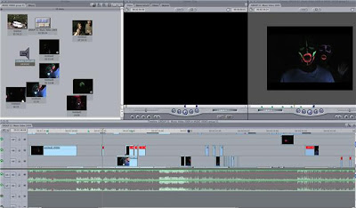
Our main application we used, without a doubt was final cut. This was our main tool to edit and create our rough cut and eventually our final project.
Photoshop was another main tool, which we used mainly for our digi pack and magazine cover. With this application we managed to manipulate photos and really add colour to there texture. This improved our overall finished piece for our magazine cover and digi pack as it was fairly easy to make bright colours stand out.
Finally we used Safari to access the media website in which we could edit and add blogs to. Blogs are a step-by-step path guide to all our progress, which is vital for the final mark, as it shows we have a full understanding of our own work.
Friday, 11 December 2009
Digipack influence


Digipak studio team
Dee Plume & Sue Denim
Produced by-Tiga
Mixed by-Jack Clarkson
Distributedby-EMI Records
With special thanks to-Tomas Turpie,Harry Carter, Ruby Brown, Chris Compton, Catherine Vining.
Studio team-
Guitars-Ghandi McTavish
Synths-Phish Phood
Bass-Mark Smith
Drums-Steve Thorne
EMI Records
Thursday, 10 December 2009
Ruby Brown's Evaluation
Within our music video (Robots in Disguise ‘La Nuit’) we created some consistent links between the lyrics and visuals, for example ‘La Nuit; (meaning ‘the night’) gave us a base for a dark setting but incorporating a ‘party’ atmosphere as the song is written about a night out and partying.
Our use of ultra violet and fast motion scenes created a hyperactive ‘jolly’ mood for the viewer, linking with the songs lyrics ‘Oh night without end’ by just focusing our video on one long movement of separate people at a party. We used UV paint; close up shots and lip-synching face shots to produce a lively charismatic mood.
If a record company were to approach and analyse our video for production use, the ways it would typify with how they’d want it represented would be the atmosphere the atmosphere that’s created within the video, the hyperactive feel and fast to slow motion shots contribute to a consistent mood for all audiences whilst still showing an original idea. The music Genre of the track is ‘dance/pop’ so we based our developing ideas around the way motion and expression is perceived, producing movements, dance and light effects in time with the beat of the music.
Our inter-textual references varied but we used each video to increase our awareness on genre and atmosphere, which helped created a base on which we could develop our ideas. We studied three main videos. ‘Pogo’ by Digitalism (our first analysis) contributed to our already existing ideas, making our focus clearer, helping us create a main focus, rather than a set story throughout it would be a visual mix of colour and movement whilst still drawing the audience to the individual characters. We also took some of our main inspiration from ‘Gotta Feeling’ by Black Eyed Peas. In this video the group use UV and dance scenes, showing a consistent beat and movement towards the music. Floating by Jape is also another inter textual reference that incorporates a fast pace theme with soft/dim lighting. We varied the fast pace in our music video by using close up slow shots with occasional blurred focus upon flashing multi-colour lights.
To gain more knowledge towards the generic conventions within our music genre we took main references of camera angles and atmosphere from our inter-textual references. We found the most common camera angles are sharp and visually impacting. A lot of group shots are present in ‘Gotta Feeling’ creating a happy active mood that works with the song.
Our whole group decided on varied lighting, concluding it would capture the viewers’ attention with each lighting difference. Keeping with soft, dim scenes we simply added bright flashes of coloured light and used a large UV bulb to bring out the ultraviolet paint placed on the characters hands and faces, we felt this really increased the feeling of movement throughout.
From a first viewing, our use of mise-en-scene becomes obvious to the audience. We chose basic costume, dark or light shirts with dark trousers to blend in with the darker back setting of the scenes however our most eye catching prop would be the ultraviolet paint creating a persona for each character. We made sure that each drawing on the characters faces were not similar to the next, so when focusing on characters in longer motion shots the audience could start understanding the actions of each single character within the video.
2. How effective is the combination of your main product and ancillary texts?
Our digi-pack design proved to contrast against the theme of our music video and our magazine advert. The light back colour and simple coloured figures placed on the digi-pack show a vast difference in atmosphere however our group thought the change in colour and calming tones proved to be aesthetically pleasing towards target audience. To create minimalist links between the digi-pack and the magazine advert, we simply used bold fonts and drawing in the viewers attention with multi coloured portraits taken and edited from simply photographs. The similarities to other album covers aren’t obvious from first glance however when studying inter-textual references we gained ideas from The Maccabees ‘Wall Of Arms’ album design. Using a simple background and image, they then increased colour and used bold lettering to capture attention, we developed our ideas and toned down our images whilst still using big bold font. Our album also relates to almost all other albums, using a front cover, art on the inside cover and giving the reader information about production and the people involved in the making of the new album. We placed track listings on the back but didn’t overload the rest with too much writing but more visuals.
Our magazine advert developed into a style which appears within most generic adverts, bold headings and bright colours draw the readers eyes however the newly released albums information is lower down the ad, smaller but still easy and clear to the viewer. We used an image of the actual artists, but edited it to support links through our whole project (ideas, video, digi-pack).
3. What have you learned from your audience feedback?
After a class viewing of our rough-cut video, we received feedback from both the class and the teacher. Our video was shown on different forms of Internet media, such as our sixth form blog, which every media student could view. We received a lot of feedback, from both students in our class and students outside our classes, the feedback proved to be really positive however certain criticisms were discussed in class, The most common being about the amount of light that’s used throughout and the fact we should have incorporated more daylight. However after reviewing these criticisms we concluded that for our final cut we should stick to our original lighting idea otherwise the theme, atmosphere and mis-en-scene could be damaged or altered by too much exposure of natural or bright lighting whereas our groups idea was to keep themes soft and much darker.
As a consequence to other feed back we decided to vary and produce different scenes, as the majority of our viewing audience from the class viewing stated that a larger variety of scenes was needed to maintain or increase the audiences’ attention. We produced more footage but keeping with our original themes such as soft lighting and increased movement.
4. How did you use new media technologies in construction and research, planning and evaluation stages?
For the majority of our research we focused upon YouTube, analysis inter textual references (music videos etc) for lighting, camera and mis-en-scene effects we could develop into our own style. We put our video up on face book to give an outside audience a chance to view our project whilst also keeping up to date with how the artist of our song produces their own style of work within the music genre.
For editing we mainly used final cut to produce, edit and focus upon our overall project whereas for our magazine advert and developing ideas we used Photoshop. Without either we wouldn’t have been able to produce our overall idea.
Our main editing process was pinpointed mainly upon cutting in between different scenes, to create a running story of every angle and character, Im really pleased with our final cut as our ideas and hard work were processed and shown through our final video.
Catherine Vining's Evaluation
1. In what ways does your media product use, develop or challenge forms and conventions of real media products?
We created a lot of links between lyrics and visuals. Because the song is about the night and going out having a good time we used minimal lighting and using glow sticks and UV as a substitute to create a party feel to our video. I think that we represented the artists as fun loving people which are the way the record company might want them to be represented. We stayed clear of using visuals towards the drugs lifestyle the lyrics include because this could offend people. The genre of the song I would say is electro pop which the video links to very well, with a modern take on visuals.
Because of the euphoric lighting we have used, this could be linked to the drug references in the lyrics.
A lot of the time we have used a straight on camera shot, but we thought that the viewer may find this slightly boring, and so we also have used panning shots, aerial views and hand held shots, to maintain interesting views for the audience.
Lighting is very minimal in the video because we thought this would better fit with the music, we used a UV light for some of our footage which makes the detail we used very prominent. We also had some footage that is in complete darkness except the glow sticks that we used.
Our props included glow sticks, UV paint and a UV light, we kept props to a minimal in order to keep it easier to organise our footage. We also only used the college grounds as our set, mainly the photography department, in the dark rooms, which was the easiest place to find that we could have complete darkness.
We were influenced a lot by other music video’s such as the Black Eyed Peas video for ‘I Gotta Feeling’ where we chose the use of UV paint from, and the idea of having ‘a party’ as part of our video. Another video we looked at was ‘Floating’ by Jape; this included the idea of having slow motion, which made us decide to edit some footage to different speeds to go along with the music. One of the other videos which attributed to our ideas was ‘Anything Could Happen in the Next Half Hour’ by Enter Shikari, we liked this because it uses lighting at the beginning to set a scene, which we really like the idea of and wanted to include something similar in our video.
Our digipack isn’t particularly similar to any we’ve seen because we’ve edited photographs a lot to make them more electric and glowing to fit in with our video’s idea. The actual album cover has a photograph of the two artists unedited, which is simpler but is more like previous covers that they have done.
Our magazine advert uses the conventions of only having minimal important details, and having something that captures the viewers’ eye and stands out. I think we achieved this by editing the photograph like we had done for the digipack and then having the bands name in the centre and adding a glow around it to grab attention to the advert. We also included logos such as ‘blue ray’ and ‘EMI records’ to add a professional feel to it.
2. How effective is the combination of your main product and ancillary texts?
I definitely think that our product is very effective because they stand out from a lot of music videos you see these days, by taking a very modern artistic approach to this we have come out with a video that hasn’t been seen previously for any other music video. Our digipack and advert are very strong and eye catching because they make the audience wonder if the song/video is like them. An eye catching CD case is always a good way to draw in a viewer, and I think we have succeeded in making one which also links in with the video we have also created.
3. What have you learnt from your audience feedback?
The audience feedback was very helpful, our group took a lot of it into account, expecially when we had finished our rough cut, many people said that it would better if our final cut had more lip syncing, and so when we did more footage we took this into account and did a lot more filming with lip syncing. Our teacher was very happy with our work, but said that we would be better doing more blog work, and so we made sure that each of us went home each day and did at least one blog about something we’d been working on, or new ideas we could link in with our work. He also said that the video could do with more editing, and so he helped us to improve our editing skills in order to have more transitions, and effects. The class feedback was very positive, they enjoyed the video because it was different to everyone else’s, the main comments were because of the lip syncing. They also informed us that we could improve some of the editing, which we did after the teacher showed us a lot of different effects and transitions we didn’t already know. Some people also mentioned that parts didn’t quite link in with the music, which lead to us speeding up, and slowing down some shots so that it went with the beat and tempo of the music.
Our feedback on the final video came back very positively, they seemed to enjoy how the visuals went well with the music, but they did seem to think we should have had more choreographed dance routines, in order to look more professional. If we were to do more filming, I think we would next time take this into account.
4. How did you use new media technologies in the construction and research, planning and evaluation stages?
In the construction of our project we used websites such as MySpace and Wikipedia to learn more about the band, since they had their own page on MySpace we emailed them over the website to ask for permission to make our video, and also to find out more about them and the song we had chosen. We used YouTube to find videos for inspiration and ideas, which we found very useful. To keep up to date and organised we used Blogger to write down everything we had done and will do, we wrote everything that we had to do down as well, this website was very useful in order to show what work we had done. Final Cut was the editing program that we used, which was very good for doing all the editing we wanted to achieve, we also used Photoshop when coming to the digipiack and advertisement poster, because it is a very good way of achieving a very artistic approach to what we wanted. For our final cut feedback we used a website called Vimeo which we found was a really good way in sharing videos.
Harry Carter's Evaluation
1. In which ways does your media product us, develop or challenge forms and conventions of real media products?
Our media product uses, develops and challenge’s forms and conventions of real media products in various ways. Our song is called ‘La Nuit’, which translates to The Night in French. We made our video very dark to reflect the song title. Some of the lyrics in our video were portrayed in our visuals for examples they talk about having a party so we made our video very lively and have a party like atmosphere. After researching Andrew Goodwins book ‘Dancing in the Distraction Factory’ he mentions that there is a relationship between music and visuals (either illustrative, amplifying or contradicting). This is what we have tried to do in our music video. The band are represented as a very unique and out-there group and we tried to make our video like this with the use of UV paints and many special effects. These effects also represent our music genre Dance, for example there is very upbeat and fast dancing and special effects have been used to speed up some footage. We took influence from other music videos to make our music video. The black eyes peas ‘I gotta Feeling’ video was used for the idea of UV paint and Friendly Fires ‘Skeleton Boy’ was used for the ideas with our dark lighting and the style in which our faces are painted. In the Friendly Fires video hey use black body suits to give a good effect and we used dark lighting and bright UV paint to create a strong contrast in our video and make it stand out. We also slowed down parts of our video like in the music video Floating by Jape. They use slow motion almost through out the video and this effect gave the video a great visual style in this video. All these were forms of intertextual references as we took these ideas and manipulated them for our music video.
We left the camera in one fixed place for most of the video, this gives the audience a clear view of the performers and enables them to see everything in the shot, it also gave the performers a large area to perform in. We also put the camera at a high angle and cut from these points making the video look more exciting and fast paced cuts.
2. How effective is the combination of your main product and ancillary texts?
We used UV light behind the camera as our only light source to make he UV paint show up. We also used glow sticks to create a party scene and give another good effect. This also gives a good contrast along with the UV paint. We have created a bright and striking visual style using UV paint, energetic dancing, special effects, glow sticks, photographic enlargers and different shot types such as close ups on lips and high angle shots.
Overall our project fits together well and each stage of the media product represents the style of the band and the genre of the song. The digipack shows neon images of the band and the magazine advert is very dark with a bright neon outline. This refers to the UV paint we used in our video and also makes the advert stand out as it is very contrasting. The digipack is very bright and striking which does not conform and relate to the lyrics ‘la nuit’ but represents the bands bright and energetic style. When we planned our digipack and magazine advert we had certain ideas that were not very representitive of the bands style. For example I had an idea of using an image of the band and cutting out around it and adding different colours. This effect looked had took much block colouring and looked completely different to the digipack style so I changed this idea and added special effects to the original picture to uit the style of the band and the digipack. I think this idea was better because it isn’t completely the same as the digipack but still conforms to the main style we were going for. We had a design concept for the digipack and I think after looking at our initial ideas we have successfully created a visually good digipack. It stands out. There isn’t many colours but the white background and the strong bright outlines of the subjects is very striking and contrasting.
3. What have you learned from your audience feedback?
From feedback we have changed and manipulated the video to make it better, for example during peer feedback we were told that there was not enough lip syncing and it was very dark so changed our video accordingly. We added a lot of lip-syncing. After adding the lip-syncing we received no bad feedback about lip syncing. We were also told that the music video was ‘Well planned out and organised’. We also received feedback after we finished the video on facebook and via peers. This feedback was a lot better than the original rough cut feedback and we think we have succeeded in making it better
4. How did you use new media technologies in the construction and research, planning and evaluation stages?
To construct our vieo we used many different technologies such as final cut express to upload and edit our video. We also used this to add special effects. We researched other videos on the internet on youtube to get influence. We took these videos and ideas from them to create our video. We planned our music video by making a timeline and brainstorming ideas. At the beginning of the project we made a pitch for our music video. In this music video we said we would have stop motion in our video, since then we decided not to have this effect and instead use speeded up footage and slowed down footage. We changed this idea because stop motion in the dark whilst using the UV light and UV paint would be very difficult and time consuming, due to the small amount of time that we had we chose to not use this idea and I think it came out better. We did stick to some things in our pitch such as we said we would use a UV light and have two main characters and some secondary characters. If we were to do anything different I think we would have planned the dance moves and choreographed the routine more. We would have also spent more time blogging.
Magaizine Advert feedback
'ties the video and digipack together well. remove the background to make the people stand out more'
'keeps with the neon theme agains like the darkness of it in comparrison to the digipack. really liked it but maybe could have used an image from the video?'
'really like this advert, is very eye catching strongly links with the theme of the video and digipack. good attention to detail with labels/review etc. very proffesional looking. wouldn't actually change this i really like it'
Digipack feedback
'good visuals. screen shots of the video?'
'simple but effective. i like the big picture on inside cover. keeps with neon theme. maybe add a bar code?'
'really nice effects, strong link to video as similar neon/uv theme. like the use of images and the variety of images used. measurements look like they might be out by a little bit? also could block in the dividing strips in either black and white'
Video feedback
'suits the music, nice effects. random shots of the group just standing in a room doesnt fit'
'I loved the whole idea of the video. maybe if you choreographed what you did instead of just random dances'
'Amazing video, love the idea of using UV paint is realy effective. dance routine is really cool and performance aspects work really well. could have a wider variety of scenes and location.'
Blog feedback
'Very visual, more posts on the planing'
'Good number of pictures, very colourful. need more blog posts'
'A lot of your posts are very visual which is good. evidence of research for ideas and locations, and screen shots show editing process which is good. 27 posts! there is five of you and someone should keep updating the blog as you have an extra person. even small paragraphs can be effective.'
This is the class feedback that we received.
Tom Turpie's Evaluation
We took the words “la nuit” (the night in French) which is said frequently through the entire song as well as the word “party”. From these two sets of lyrics we chose to use minimal lighting and bright colours to produce a party atmosphere within the video. We also attempted to write “la” and “nuit” on each side of one of your group members hands so that when the words were said in the song he/she could turn his hands to reveal the words. Because the song we chose is in itself quite unique and exciting we tried to portray this through the video to try and create a gripping and electrifying feel to it, unlike anything people would expect a video would look like from a group of A2 media students. The music genre (Dance/New wave) is very prominent within the video, due to the heavy of UV paint and special effects. There is also a large amount of dancing which has been enhanced with the special effects used and also by sleeping up/slowing down. We got the inspiration to use the UV paint from the Black Eyed Peas video for the song “I Gotta Feeling” which features a heavy use of the substance much like our own video. We also took the inspiration to use time effects from the music video “Floating” by Jape which is primarily shot in slow motion. The last video we took influences from was Friendly Fire’s video for the song “Skeleton Boy”, from this we took the idea that the performers were not visible but the UV paint stood out giving it a other worldly and surreal feel to the video. We kept the camera in a fixed position so that the performers had a wider space to experiment with different dances etc. We used a UV light as our main source of light as we wanted the UV paint to to stand out while the performers were hardly seen. We have always tried to keep the visual quite stimulating and striking with the use of the UV paint as well as glow sticks, photographic enlargers (which we manipulated to make them different colours) , SFX, and outlandish dancing.
2. How effective is the combination of your main product and ancilliary texts?
Our project seems to meld together seamlessly as we have tried to keep the same invigorating style throughout the development of each of the parts. By having out digipak simplistic yet colourful style much like our video but instead of it being black it has a much lighter feel so that instead of it being black it has a white sleeve. This allows it to go with our video but also create some sort of contrast between each of them much like many other bands/artists do. i did this as i did not want the digipak, video and magazine add to be exactly the same as i thought it would make the project seem bland and as if we had simply given up on creating something interesting and different to the other pieces in our assignment but still able to relate to it, which i believe i have achieved. The magazine advert also fits nicely with the image we were trying to give to the band as it still follows the video’s artistic style quite closely, i believe that in this case the design of the poster should be very similar to the video as, if people had seen the video and liked it, they would then see the poster recognise the style and buy the album.
3. What have you learned from your audience feedback?
When our video’s rough cut was shown to the class and put up onto different forms of internet media, such as Facebook and vimeo we had a wide variety of different positive points and criticisms. Many people loved the style we were putting into our video but also we were told that we needed different shots, shooting in day light both of which we chose not to take into account as we had a strong view on how the music video’s art direction and we believe that introducing either of these would not suit it. Another point we were given was that we should have put lip syncing into it which we had planned to do but at the time that we had to produce the rough cut, the UV paint I had ordered had not turned up and thus we could not film the lip syncing parts of out video. Since we have produced the our final cut, all of the feedback has been incredibly positive to the point that random people within the school that had seen our video on Facebook would come up to me and tell me how good they thought our video was. Due to this excellent response to our video I think that the finished product is both what our group wanted to create and also appealing to the public which is what we were wanting to achieve. The teacher feedback we were given was mostly positive, there were a few points that out teacher did pick up on. These were that at certain points within the video the there were visual dips where the audiences interest could be lost due to some of the shots being held for too long, this was also partly because our song was slightly. I removed this by editing random clips of the performers into the shots, speeding them up, adding effects. after doing this i believe and as does my teacher that these visual dips had been removed and the video ran for the full 4 minutes with the viewer staying fully captivated by it.
4. How did you use new media technologies in the construction and research, planning and evaluation stages?
Throughout the time when we created our video we used the program final cut express, i believe that this is a very powerful piece of software and seeing that i was the primary editor in my first year of media studies i had become quire proficient at using it. For both the Digipak and magazine advert we used the program photoshop, again due to the fact that i took art (digital and mixed media) in my first year and also own this software this made it easier for me to create the digipak. We also used the internet to generate interest and feedback in our video, using facebook, vimeo and youtube. By using these websites we created a better video as it gave us a chance to see how people would react to it, and thus better it but editing to remove parts that people disliked and add what they thought would improve it.
Thursday, 26 November 2009
DigiPak


This is our digipack, which we think works really well, we feel that it fits in with the mood that our video was trying to create. i think that we were successful in making the band seem really fun. the digipack has photographs of the band that have been edited so that the pictures are more electronic to fit in with the genre of the music. we also included details about the album, including what other songs, and the producing details. we also included logo's of a record company to make it look more proffessional and realistic.
Magazine Advertisement
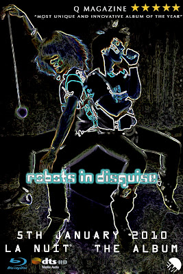
This is our music video magazine cover, we took the same idea as we did with our Digipack. We find that many of the colours we used in the magazine cover stand out because it appeals the viewer, and it also fits the genre that we picked. We had feedback relating the song to the genre we have chosen and most of the feedback was possitive. We added such labels as blueray, EMI records, and HD to give it an authentic look and add a touch of realism to the product.
I personally believe that i could see this magazine cover on display as it has a strong realistic feel about it.
Friday, 20 November 2009
Original CD cover
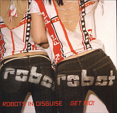
This is the bands original CD cover for the album, we liked the idea of having a photograph of the band on the front cover, we took this into account when making our own digipack and magazine cover.
Wednesday, 18 November 2009
Editing
Tuesday, 17 November 2009
GROUP 51 FINISHED MUSIC VIDEO
Q3-51 MUSIC VIDEO 2009 from SATMEDIASTUDIES on Vimeo.
We're really happy with the outcome, and we've had feedback from some members of the class, which also think we've created a really good music video.
'i love this video its very unusual but matches the song brilliantly just think you would benefit from having choreographed movement.'
i we were to do the video again, we would probably take this comment into account, and take more time to come up with choreographed dances.
'The video suits the music, the effects are brilliant especially when the girls' lips are bright red. Dance routine is fits well with the song. :D'
Monday, 16 November 2009
Editing techniques
Doing this increased the atmosphere and mood, making it seem lively and fun, drawing in the audiences attention for a longer period of time.
One of the main effects used on short, sharper footage is 'dazzle' on final cut. We also increased and slowed some footage to vary the overall pace of our video.
Monday, 2 November 2009
Rough Cut Feedback
1. What do you rate as strengths of the music video?
- Good Editing
- Fits with theme of song
- Looks modern
- Nice Idea
- Good use of differen't shots
2. What do you think are the area's of improvement?
- Quite repetitive
- No lip syncing
- Bit long
- Plain Random shots
- More people needed
- include band and singer
3. What do you think the group should change?
- Differen't location
- Keep singers vague
- More shots of faces
- Add band
4. What has the group still got to do?
- Add more scenes and/or effects to make it seem less repetitive
- Add Lip syncing
we will take some of the advise given to us and try and apply it to our music video.
Video
This is a video that has a part at the beginning that we think has a similar idea to something we want to achieve
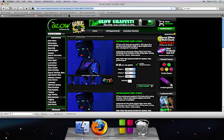
UV paint
we ordered:
6 pack of skin safe uv paint
uv contact lenses
this came to around £38
We are going to use these items in our video and paint ourselves to give the effect in the style of the skeleton boy video by friendly fires we have refered to in our mood board and on another recent blog
http://www.glowshop.com/
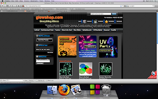
http://www.theglowcompany.co.uk/acatalog/UV-FACE-BODY-PAINT.html
Tuesday, 20 October 2009
Influences
pogo - digitalism
http://www.youtube.com/watch?v=Sicf2CECUBo
Due to a problem with the 'embed' link we were un able to put the video on our blog, but the link to YouTube is above.
Monday, 12 October 2009
Locations for filming + Ed Lovelace
Suggestions
Shed
deserted house
feild
kids play pak
public areas
garages
Ed Lovelace Talk In The Hall
Ed Lovelace is an ex Long road student who studied media. He kindly came in to talk to us about the music video industry. He has worked on smaller bands music videos and has progressed on to bigger budget and bigger band videos. for example he directed the gallows first video with only £100 budget and then went on to create two videos for the band Cage the elephant for £40,000 each. He is hoping to break into the film industry with his documentay/film called Werewolves across America but the film distribution is at a standstill because he needs clearance from the artist he was following in the documentary.
There is three main jobs when directing a music video, Director of photography, art director and cinematography. Each video has a set amount of time for each job to be done. The pitch takes three days, planning is one week, filming is one day and editing is three days making the whole process a two week project.
Certain parts of the footage in filming need to be changed, for example you can use colour correction to make the film look how ever you want it to such as changing atmosphere or the brightness of the shot.
Tuesday, 6 October 2009
ED LOVELACE - TALK IN THE HALL - WEDNESDAY 7.10.09
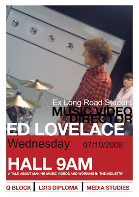
Former Long Road Media student Ed Lovelace will be talking about his music videos and career path into the film industry.
Please remember to take notes on the talk and the videos discussed - In the next lesson you will be writing up the talk on your blogs and from YouTube adding the videos he will be showing in his presentation.
'Ain't No Rest For The Wicked' - Cage The Elephant
'In One Ear' - Cage The Elephant
'Abandon Ship' - Gallows
'Laser Hannon' - Cutting Pink With Knives
Monday, 5 October 2009
Lyrics
"I breathe the sweet air of the city
City, city, ah-ah.
It circulates the neon colors
Neon, neon, ah-ah.
I imagine a film in French
french, french, ah-ah.
In this bloated white Mercedes
In this bloated Mercedes.
The night,
tonight,
Oh night, oh night without end.
Midnight I'm so high at the party.
party, party ah-ah.
The mix of vodka gel�e and the beat
the beat, the beat ah-ah.
You flash on the balcony of Paris
paris, paris, ah-ah.
And me excited, with your look risky,
you with your exiting look.
The night,
tonight,
Oh night, oh night without end.
The night,
tonight,
Oh night, oh night without end.
Search the tomb of Gainsbourg for six hours,
six hours, six hours ah-ah.
Our hearts, cocaine, at Montparnasse
cocaine, cocaine, ah-ah.
It assassinates one of these tunes
These tunes, these tunes ah-ah.
it plays hide and seek in the morning,
plays hide and seek.
The night,
tonight,
Oh night, oh night without end."
....
from this we can establish a clearer picture of the songs substance and can
also incorperate our own ideas to fit with whats being sung.
Costume and camera
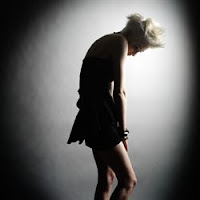
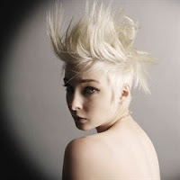
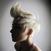
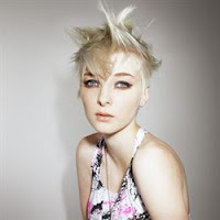
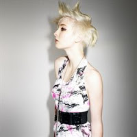
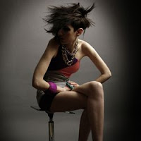
With these images,
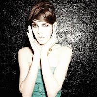 we can vastly develop our ideas towards costume, camera and even some lighting techniques!
Influence
Thursday, 1 October 2009
Post card final idea
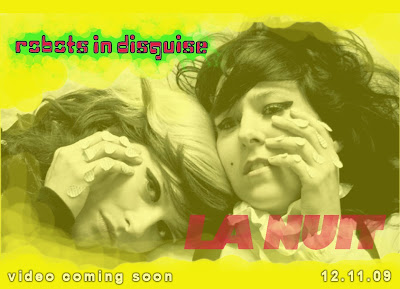
We have designed a post card to advertise our music video. On the post card we have put information about the videos release date. We used very bright colours which reflect the style of the music. Also this stands out and is very eye catching
Wednesday, 30 September 2009
Possible Locations
- Inside
- Black Backgroud
- inside a small room
- pitch black (widows blocked out)
This is the black eyed peas video "i gotta feeling" which we have studied in the way that they use lighting and UV effects as we should be using most of them in our own.
this video is a influence on us as we plan to use slow motion in parts of our own video.
Possible Props
- UV paint & UV lighting
- accessories such as sun glasses
- black clothing
- cake and other food related objects for food fight.
Wednesday, 23 September 2009
Pitch.
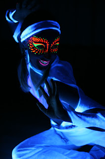
my thought was to incorporate UV paint into the mise en scene of the video. putting it on the main character, secondary characters and perhaps group shots (dancing).
The main video will have some stop motion included into the video which will most likely be a small amount throughout the video. the music video will also change atmosphere such as location and then change from daylight to night.
we will have two main characters and then a few secondary characters in the video and there will be a story line based to the video. the two main singers take most of the screen time while as the rest of the band are shown every now and then through fast cuts and will most likely become background characters.
the music video "pogo" by digitilism has become a stepping stone for our production of the music video. the whole video is very fast stop motion which looks almost like the band is moving on a regular camera. This technique also shows the lead singer as if he is floating in the center of the room due to the amount of stop motion.
the equipment we will be using will consist of UV paint for the band and other characters. we will also be using a large amount of lighting effects such as UV light, dim lights, colour filters and strobe lighting which will play a big part in the video as it will add an additional stop motion effect.


